(click on any photo in this post to enlarge it)
Photography is a strange blend of technical skills and knowledge and creative abilities. On the technical side you have things like f-stop, shutter speed, depth of field, etc. On the creative side you have things like composition and vision. The technical side of photography is easy to learn, there are rules, formulas, relationships etc and I’ve always compared learning the technical part of photography to learning your multiplication tables. Once you learn it you never forget it. However you learn best, flash cards, pictures, diagrams, lists, etc you just need to sit down and study. Learning the artistic side of photography is not so easy, or at least not for me. And while you can divide photography into 2 ‘parts’ to write about it and teach it, the 2 parts aren’t really separate. To create the photograph you want you have to master both and master how they work together. One thing that I have found that has helped me is to try and critically analyze my photographs after a shoot. I try to ask myself why I like one photograph, but not another. It is also interesting to me to study how relatively little changes in composition can have a major impact on how I feel about the photographs I might make of a particular scene.
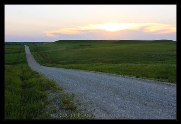
Recently I braved the heat (I don’t like hot weather so for me going out in the current heat wave really was brave!) and went out along Deep Creek Road and Old K18 with another photographer to photograph the moon rise. While waiting for the moon to show up we spent some time photographing the road running across the Flint Hills. The particular point we had stopped at is where the road runs up over a hill and you get some great views of the road disappearing off into the distance. I decided to make a series of photographs of the road disappearing into the Flint Hills. The first one of these is the photograph above. In this photograph I’ve placed the road disappearing into the middle of the frame. The horizon is also near the center of the frame. While this can be effective sometimes (especially when you want symmetry in your photograph), in this case I feel that it divides the scene into 3 distinct parts. There is no clear center of interest. Do I want the viewer to look at the road? The left side of the road? The hills on the right? The sky? What is this photograph about?
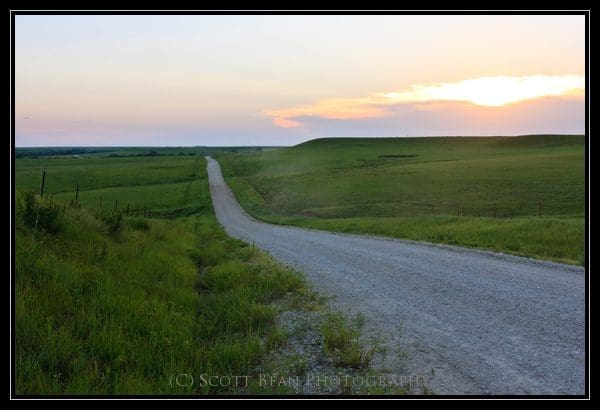
In this next photograph, I’ve changed my position slightly to move the road to the left side of the frame. Now the photograph is simplified, there is only the road and the hills/sky on the right. The road forms a border along the left side of the photograph. For me, this emphasizes the right side of the photograph and places more attention on the hills and sunset. The horizon is also not directly in the center of the frame and the foreground (the road) is emphasized more because of this. The difference between these 2 photographs is due to only slight changes in camera position.
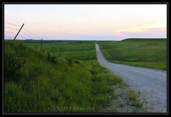
In this next example, I’ve moved the road to the right side of the frame. Now I have a fence line running along the left side of the frame. This photograph is very cluttered to me, the road appears ‘cut off’ on the right side. Now I have a photograph of the fence and a photograph of the road both crammed into 1 frame. Not good. Of these 3 photographs the second one is the most pleasing to me. The second photo has better balance and the entire scene ‘fits’ better together.
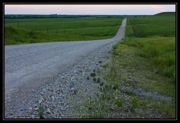
To make this next photograph I moved to the other side of the road. Now I’ve placed the road running from left to right and I’ve excluded most of the sky. This places a lot of attention on the road. In fact in this photograph the road is just about all you notice, everything else has been eliminated. I think this would have been a stronger photograph if I had shifted so the road disappeared over the horizon a bit more to the right in the photograph. So which of these photographs is the best? None of these photographs are particularly striking, but the last one is the closest to what I had in mind when I was making these. What I wanted to create was a photograph of the road running off into the distance. I didn’t want a photograph of a fence line running off into the distance. I didn’t want a photograph of the hills along the side of the road, I wanted a photograph of the road. Why do I like #4 better than #2? To me ‘Old K18 road #2’ isn’t really about the road. With the road running along the left side of the frame it is more of an edge or a border, not the main subject.
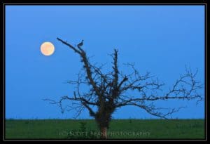
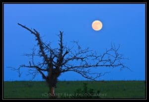
The 2 photographs above also demonstrate how minor shifts in your composition can result in very different photographs. In the first photograph I’ve placed the moon to the left of the tree. I selected this composition because I thought having the moon on the left would balance the branches on the right side of the tree. I don’t like this composition as well as I do the second photograph. To me the second photograph has better balance. The first photograph feels ‘heavy’ to the right side. The moon and the tree ‘go better’ together for me in the second photograph. If you look closely you can see a bird in the top of the tree near the moon in the first photograph. Ideally I would have gotten a photograph with the bird in the tree, but the moon on the right side of the tree. The bird didn’t cooperate with me though and left before I could get repositioned.
So if you are still reading this you may be wondering what the point is of my ramblings in this post. It isn’t to try and convince you which of the photographs in this post are the ‘best’. Art is subjective (thankfully!) and there is no ‘best’ photograph. You may like one of the examples that I didn’t and that is fine. How you arrange (or compose) elements in a scene is very important (wow that is a ground breaking statement isn’t it?!). Finding a great subject in beautiful light and knowing how to use your camera is great, but if at some point in the process you don’t stop to think what it is you are trying to “make” you will most likely be disappointed when you get home and download your photographs. This isn’t about “spray and pray” either…taking a bunch of photographs in the hope you will get one you like. You can certainly do that (and I have done that more times than I would like to admit). It is about trying to think about “creating” something. And thinking about how relatively minor changes in how you compose your photographs can have a large impact on how they look and feel. Not happy with your photography? Maybe you need to slow down and think about your scene and subject and what you are trying to create. I know I do. With all things there is a balance that needs to be achieved and for me there is definitely a balance between not thinking enough and over thinking things when I’m photographing. Not thinking enough is normally what I struggle with and when I fail to create the photograph I wanted to it is because I didn’t think enough about the details of my composition and what I wanted my photograph to say.

